Mobile Friendly Test
Test whether your website is mobile friendly and see how it looks on phones. Google uses mobile-first indexing, so the mobile version of your site is what matters most for rankings. Key features: made for webmasters, fast results and free. It is 100% free, works on mobile and desktop and needs no sign-up – just open the tool and start now. Simply add your input, click the button and get your result in seconds.
Share on Social Media:


Mobile Friendly Test is a free online mobile friendly test by 𝐏ᴅꜰ𝐒ᴇᴏ𝐓ᴏᴏʟ𝐬.𝐂ᴏᴍ. Test whether your website is mobile friendly and see how it looks on phones.
In short: add your URL or code, click the button and get your result in seconds. It works in any browser on mobile and desktop, with no sign-up and no software to install.
How to Use Mobile Friendly Test (4 Quick Steps)
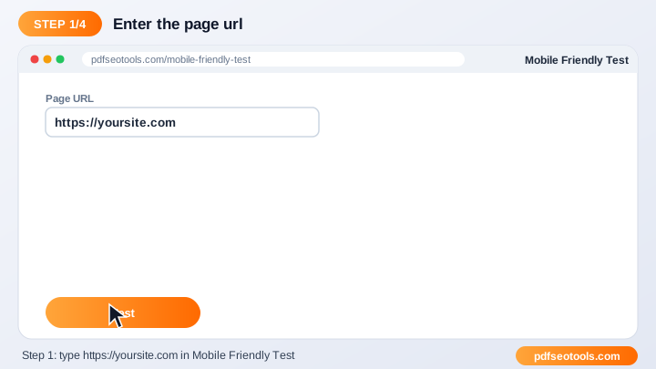
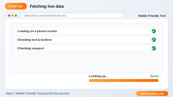
To use the Mobile Friendly Test, follow these 4 simple steps:
- Step 1: Enter the URL, code or details requested by the tool.
- Step 2: Select any options shown on the page.
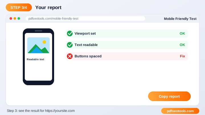
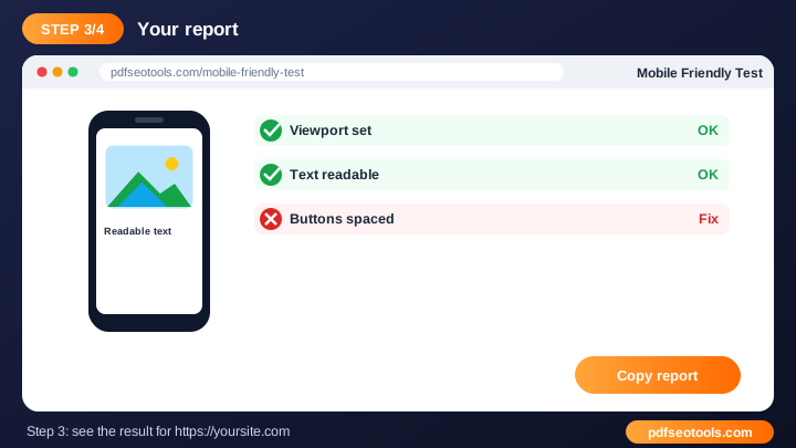
- Step 3: Click the main button to run the tool.
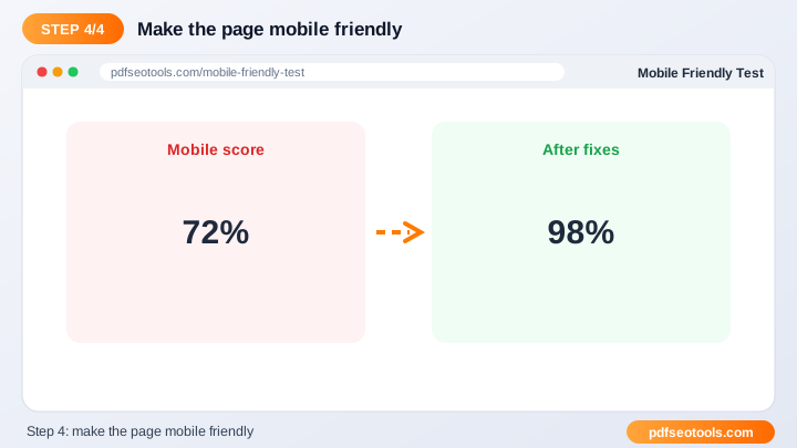
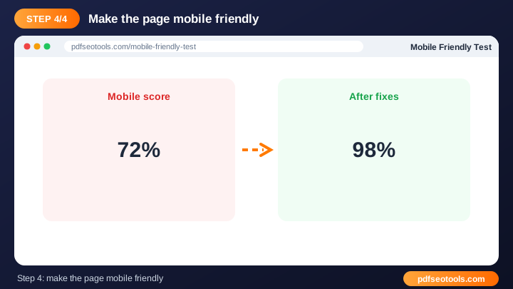
- Step 4: Review, copy or download the result.
What is Mobile Friendly Test?
Mobile Friendly Test is a browser-based webmaster tool that turns URL or code into result without installing any software. Google uses mobile-first indexing, so the mobile version of your site is what matters most for rankings.
Mobile Friendly Test – Quick Facts
| Feature | Details |
|---|---|
| Tool type | Free online mobile friendly test |
| Input | URL or code |
| Output | result |
| Price | Free – no hidden charges |
| Sign-up required | No |
| Installation | Not required (works in the browser) |
| Supported devices | Windows, macOS, Linux, Android and iPhone |
| Connection | Secure HTTPS |
| Steps to finish | 4 |
How Does Mobile Friendly Test Work?
Depending on the tool, it either processes the code or details you provide, or connects to the URL you enter and reads the public response from that server. The output is then formatted into ready-to-use code or a clear report.
Key Features of Mobile Friendly Test
- Made for webmasters: Solves everyday website tasks in one place.
- Fast results: Get output or reports in seconds.
- Free: Use the Mobile Friendly Test at no cost.
- No technical setup: No plugins or server access needed to try it.
- Works on any device: Desktop, tablet and mobile supported.
- SEO friendly: Helps you build faster, cleaner and better-optimised websites.
Mobile Friendly Test Analytics: Online Tool vs Other Methods
An online mobile friendly test is faster to start than manual work or desktop software, because there is nothing to download, install or update. The table below summarises the difference.
| Criteria | Manual method | Desktop software | Mobile Friendly Test |
|---|---|---|---|
| Cost | Your time | Often paid | Free |
| Installation | None | Required | None |
| Works on mobile | Difficult | Limited | Yes |
| Learning curve | High | Medium | Low |
| Updates | — | Manual | Automatic |
Who Uses Mobile Friendly Test? (Common Use Cases)
Students, bloggers, office workers, business owners and developers use this free webmaster tool for tasks like:
- Checking new designs
- SEO audits
- Fixing mobile issues
- Client reports
Common Problems and How to Fix Them
URL cannot be checked
Make sure the URL starts with https:// and the website is online and public.
Result differs from my browser
Caching, location and device type can change what a server returns.
Generated code does not work
Paste the code in the correct place (for example inside <head>) and clear your cache.
Tips for Best Results
- Test changes on a staging site before going live.
- Keep a backup of files before you replace them.
- Re-run the tool after every major update.
- Combine it with our SEO Score Checker for a complete audit.
Common Mistakes to Avoid
- Uploading changed files without a backup.
- Testing only the desktop version of a site.
- Forgetting to clear cache after making changes.
- Editing .htaccess or code directly on the live site without testing.
Why Use Mobile Friendly Test on 𝐏ᴅꜰ𝐒ᴇᴏ𝐓ᴏᴏʟ𝐬.𝐂ᴏᴍ?
𝐏ᴅꜰ𝐒ᴇᴏ𝐓ᴏᴏʟ𝐬.𝐂ᴏᴍ gives you a fast, private and free mobile friendly test with a clean interface and no sign-up. The page is mobile friendly, loads quickly and sits next to many related PDF, image, text and SEO tools, so you can finish your whole workflow in one place.
Related Free Tools
- Adsense Calculator – free online adsense calculator
- Screen Resolution Simulator – free online screen resolution simulator
- Bulk Email Validator – free online bulk email validator
- Bilibili Video Downloader – free online bilibili video downloader
- Dailymotion Video Downloader – free online dailymotion video downloader
- WordPress Theme Detector – free online wordpress theme detector
Need Help? Website Support
If the Mobile Friendly Test does not work as expected, refresh the page, use the latest Chrome, Edge, Firefox or Safari, and check that your input is correct. Still need help or want to suggest a new feature? Contact the 𝐏ᴅꜰ𝐒ᴇᴏ𝐓ᴏᴏʟ𝐬.𝐂ᴏᴍ support team.
Frequently Asked Questions (FAQ)
Why is mobile friendliness important?
Most visitors use phones and Google indexes the mobile version.
How can I fix issues?
Use a responsive theme, readable fonts and properly spaced buttons.
Is it free?
Yes, completely free.
Is the Mobile Friendly Test safe to use?
Yes. 𝐏ᴅꜰ𝐒ᴇᴏ𝐓ᴏᴏʟ𝐬.𝐂ᴏᴍ uses a secure HTTPS connection, and files or text you submit are processed only to give you the result. Uploaded files are removed automatically.
Do I need to create an account to use the Mobile Friendly Test?
No. You can use the Mobile Friendly Test for free without registration. Simply open the page and start using it.
Does the Mobile Friendly Test work on mobile phones?
Yes. The tool is fully responsive and works in Chrome, Safari, Firefox, Edge and other browsers on Android, iPhone, Windows and Mac.
Conclusion
The Mobile Friendly Test is a quick, free and secure way to turn URL or code into result. Bookmark this page so the mobile friendly test is always one tap away, and share it with anyone who needs it.